
Economy
See other Economy Articles
Title: Average Hourly Earnings: Deciphering Historical Trends
Source:
soso
URL Source: http://www.advisorperspectives.com/ ... Average-Hourly-Wage-Trends.php
Published: Feb 20, 2016
Author: Doug Short
Post Date: 2016-02-20 20:03:29 by SOSO
Keywords: None
Views: 9442
Comments: 28
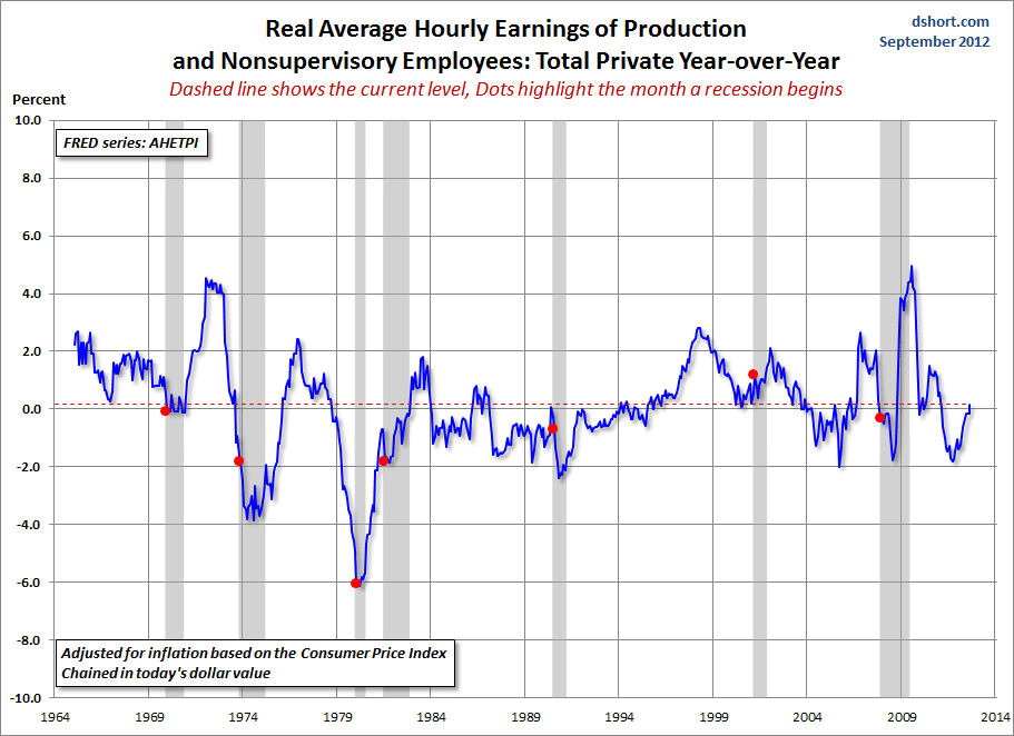
Average Hourly Earnings: Deciphering Historical Trends September 12, 2012 by Doug Short There is, however, another broad series that dates from 1964 -- one tracks the hourly earnings for Production and Nonsupervisory private employees. Before we look at that complete series, here is an overlay of the two (Total Private and Production/Nonsupervisory) for the overlapping timeframe. The objective is to see the relative correlation between the two. Now let's step back and view the complete Production/Nonsupervisory series, which dates from January 1964 (giving us a January 1965 start for the YoY data). At first glance the chart looks horrible. We are currently at a level below the start of all recessions. But the chart above is totally misleading. The single biggest force in hourly wages over the last half century has been inflation. So let's have a look at the same chart, but this time with the hourly wages adjusted for inflation using the Consumer Price Index as the deflator and chained to today's dollar. The "real" picture is far less grim. Yes, hourly wages, YoY, are currently just fractionally above zero (0.15% to be precise), but that's higher than the YoY number at the start of all but one of the recessions in this timeframe. But wait. Before you write me off as a hopeless optimist on private wages, let's look at two more snapshots: nominal and real wage growth using dollar values for the vertical axis. Remember, the series that starts in the 1960s is for Production and Nonsupervisory employees. To give us a clue about the spread between the longer series and the total private series from early 2006, I've included it as well (the red line). The first of this pair has an obvious look about it. Hourly wages have grown dramatically. But when we adjust for inflation using the CPI, we get a very different picture. Real hourly earnings peaked in January of 1973 and hit a trough in May of 1995. Note that the peak was followed later in the year by the Oil Embargo and the onset of the era of stagflation. There are many underlying forces at work in the chart above: the growth of women in the labor force (which began accelerating in 1973 and began peaking in the mid-1990s), gender differences in wages, the impact of automation on labor tasks, the secular trend away from manufacturing toward services, etc. Suffice to say that, in real terms, the average hourly earnings for Production and Nonsupervisory employees, as the latest update, comes to about $39,500 for a 2000-hour work year. The average for all private employees (the series that dates from 2006) is about $7,500 more at $47,040. Are these dramatic advances over the mid-1960s? No. When we adjust for inflation, chained in today's dollar, the average annual figure in 1964 would have been $37,072 (the comparable purchasing power of a 1964 annual salary of $5000 for Production/Nonsupervisory employees). At the household level other trends were afoot -- not least of which was the growth of two-income households as more women entered the workforce. But the percentage of two-income households has been eroded by the Great Recession and the demographics of aging boomers entering their retirement years. If we look at the Census Bureau's historical data, we can calculate that the ratio of two-income households to single-income households peaked in 1994 at 51.5% (see Table H-12). The ratio of two-income households to all households peaked the following year at 35.5%. As of 2010, the most recent year in the CB's published data, the ratios have dropped to 45.5% and 31.6%, respectively. I'll close this commentary with a longer look back. The main series illustrated above was for Production and Nonsupervisory employees dating from 1964. The BLS has a series dating from 1939 for Manufacturing employees. Here it is, adjusted for inflation. The year of the peak resonates with me personally in one respect. It was the year I had my first encounter with a personal computer, the Apple II, which was released in 1977. That fledgling Apple quickly demolished its early competition, Radio Shack's TRS-80 and the Commodore PET. Flash forward to the present: Last month we learned that Apple has set a new record for market capitalization. The Apple II, of course, was a manufactured product, but one that introduced the masses to radically new ways to approach business and pleasure. It marked a turning point in the transition from the Era of Manufacturing to the Information Age. I remain skeptical of average hourly earnings, nominal or real, as a leading or coincident indicator of business cycle peaks and troughs. But in the larger historical context, a chart of hourly wages tells us a great deal about once-in-a-lifetime secular trends in our economy and culture. Poster Comment: Some lessons are worth reviewing as many rend for forget them and more seem never to have learned this one. "There are many underlying forces at work in the chart above: the growth of women in the labor force (which began accelerating in 1973 and began peaking in the mid-1990s), gender differences in wages, the impact of automation on labor tasks, the secular trend away from manufacturing toward services, etc. From a wages standpoint, the manufacturing-driven economy in the US peaked in January 1978. The greatest acceleration was during the WWII years, I remain skeptical of average hourly earnings, nominal or real, as a leading or coincident indicator of business cycle peaks and troughs. But in the larger historical context, a chart of hourly wages tells us a great deal about once-in-a-lifetime secular trends in our economy and culture." 


 From a wages standpoint, the manufacturing-driven economy in the US peaked in January 1978. The greatest acceleration was during the WWII years, followed by a dip during the adjustment period bracketed by the first two post-war recessions. The acceleration resumed, at a reduced pace, to the peak in January 1978.
Post Comment Private Reply Ignore Thread
Top • Page Up • Full Thread • Page Down • Bottom/Latest
#1. To: tpaine, vicomte13 (#0)
More lines to confound you. Manufacturing jobs were higher paying jobs? Really? Not according to the following lines. As early as 1969 the manufacturing hourly wage was less than the production and non-supervisory hourly wage. The term Rust Bowl (Belt) didn't appear until the 1980s, well after 1969. LINES MATTER. потому что Бог хочет это тот путь
all this proves is wages have been chasing inflation
It proves much, much more than that. But it appears that you will never know. Ask yourself, please, if the lost manufacturing jobs have been replaced by lower paying service type jobs how come the real hourly wage in 2014 was the same as in 1969? That is mathematical impossible. потому что Бог хочет это тот путь
Not really, you have a lot of high paying jobs in those service industries that balance out the part time and casual jobs in the fast food stores and supermarkets and probably there is a little smoothing in the statistics like disregarding the highest and lowest items in the data
Not really, you have a lot of high paying jobs in those service industries that balance out the part time and casual jobs in the fast food stores and supermarkets and probably there is a little smoothing in the statistics like disregarding the highest and lowest items in the data Oh Lordy, Lordy!!! Whatever you say, Lance. потому что Бог хочет это тот путь
Can you produce some metrics about relative productive rates of the USA with respect to Europe?
Can you produce some metrics about relative productive rates of the USA with respect to Europe? Probably not any better than you can for yourself. I would have to start from scratch on this as I have not looked at this before. But experience tells me that the discussion would get hopeless blurred after just peeling the first layer of the onion. Even the readily available data from U.S. agencies - which is much, much more detailed, segmented, dice and sliced than anything that you can find about European countries - quickly requires one to make inferences, mathematical adjustments, etc. to allow rational, much less supportable or widely accepted conclusions. I would bet that the first problem encountered would be finding readily comparable data for the set of countries analyzed. It is akin to analyzing health care data from country to country, it is virtually impossible to find directly comparable data in order to make sure you are comparing apples to apples. Specifically what question(s) are you trying to answer? потому что Бог хочет это тот путь
There are at least three ways in which the lost manufacturing jobs can nevertheless be accompanied by the same comparable hourly wages. FIRST: there is the question of inflation. The numbers may be "inflation adjusted", but of course the inflation statistics themselves are monkeyed with in ways that under-report real inflation. SECOND: there is the matter that the wages of which you speak are AVERAGE. The average of $60,000 and $40,000 is $50,000. But the average of $99,000 and $1000 is also $50,000. In the earlier case, both ends of the average can live. But in the second case, the first person lives well and the second person can't survive. Both averages are the same. We all know that the wages at the top of the scale have twisted way upwards relative to the average. So, you have McJobs at lower wages, and you have high paying jobs in the favored sectors living well. Same average, but much worse actual conditions for the bottom half. If you want to be more persuasive, use median figures, not average figures. THIRD, there is the matter that if you measure unemployment the way it used to be measured, during the Depression, or the way it is measured in other countries, the American unemployment rate is about 16%, not 6%. Once people drop out of the work force, they don't have wages at all, and they drop out of the statistics. So, your "average wage" can stay the same, in a society where suffering grows immensely, because the people utterly wiped out by the loss of manufacturing, and unable to become permanent re-employed, don't even figure in your numbers. But they DO vote. For Trump.
"FIRST: there is the question of inflation. The numbers may be "inflation adjusted", but of course the inflation statistics themselves are monkeyed with in ways that under-report real inflation." The charts report REAL Wages, i.e. adjusted for inflation. So as long as the basis for adjusting for inflation over the time series of the data being reported has not changed this is not at factor. "SECOND: there is the matter that the wages of which you speak are AVERAGE." If you want to be more persuasive, use median figures, not average figures." The persuasiveness of data isn't any more or less whether it is reropted as the median/average or the mean. Neither alone gives you a full picture of what the data set looks like. The fact is that for the purpose of this discussion the reporting of average income vs. mean income or vice versa doesn't make too much of a difference. Given that the charts report income for Non-supervisor workers the spread between lower paid and higher paid non-supervisory personnel is not likely to be significant, and certainly not an order of magnitude. The extent to which the average is different from the median is an indication about the size of the standard deviation, or how wide the data is scattered and/ or skewed. Now the standard of deviation around the average in any given year of over a period of time in question could have changed. Given that the charts report income for Non-supervisor workers the standard deviation around the median is not likely to have varied much and the difference between the mean and median is likely not that much as well. Why don't you post the data in terms of the median if you wish. I am not getting paid for doing this. "So, your "average wage" can stay the same, in a society where suffering grows immensely, because the people utterly wiped out by the loss of manufacturing, and unable to become permanent re-employed, don't even figure in your numbers" First, these are no MY numbers but what the U.S. government reports. NOw, given that the REAL average wage of Total non-supervisory personnel is the same in 2014 as it was in 1969, the only way that that could happen is if the wages of remaining service employees were at least as high or higher than the wages of the manufacturing jobs that were lost. The arithmetic on this is irrefutable. Less people would have to be making the same or more hourly wage elsewise the average wage would decline not remain the same. An additional point, there were a whole lot more people working in 2014 than in 1969. In other words, the number of data points grew by a significant amount over that time frame. This is strong, if not irrefutable, evidence that the new service jobs were paying at least as much as the manufacturing jobs that were lost. You just cannot escape the rigors and precision of arithmetic, especially when you are dealing with a huge amount of data in the data set. потому что Бог хочет это тот путь
We know, you are not paid for the honest inquiry or debate.
No, SOSO, the charts DON"T report the REAL wages, adjusted for inflation. They report the "real" wages, adjusted for "inflation". Our inflation numbers themselves are tricked. They are established by the government, using a formula that has been tinkered with again and again in ways that consistently show inflation to be less than it is. It is eye opening to look into the making of the numerical sausage. The same thing is true with unemployment statistics. Over the years they keep tinkering with the way it is calculated, and the direction of the tinkering is always in the direction that protects the politicians. The full ugly weight of inflation and unemployment is teased out of the statistics. It's like crime statistics, a notoriously inaccurate measure of the real state of crime, and virtually useless for cross-border comparisons, because every country measures crime differently - and each country measures crime in ways that support its government. All of that plays hell with the sort of statistical analysis you're trying to do. You're trying to prove something with numbers whose underlying bases are not concrete bricks. You would be correct if you said "these are the the only numbers we have, so that's what we have to work with". That's true. But the ticky-tacky and tendentious nature of the numbers mean that we should not believe too terribly much in the results of our analyses. It is difficult to win in a tricked casino, and government statistics are a tricked casino.
----- wages of remaining service employees were at least as high or higher than the wages of the manufacturing jobs that were lost. ---- This is strong, if not irrefutable, evidence that the new service jobs were paying at least as much as the manufacturing jobs that were lost. I'm not 'confounded', --- seeing that my point has always been that a service economy does not create true wealth. -- The production of raw materials and using them to create goods create wealth/capital. Wealth/capital is spent on goods and services. A 'service economy' is not self sustaining. America must produce goods to pay for what it consumes..
I have no desire to escape from the truth, ever. When the arithmetic is performed on numbers that do not really measure the truth, the arithmetic may be done precisely right, but the conclusions drawn from the solution are not accurate representations of reality and truth. When the inputs are tricked, the output is deceptive. In other words, GIGO: Garbage In, Garbage Out. I do not challenge your sincerity at all. I do not challenge the work you have done. I do state flatly that the product of your work is a picture that is as realistic as Soviet-era and Communist Chinese production statistics. The math produces those outcomes from official statistics, but the official statistics themselves are faked - not by you, but by the officials themselves. We cannot GET TO the truth, because the assembly of such a bewildering array of data is dazzlingly expensive and requires government power and money - it's too expensive to do it privately. The government collects data, but the government chooses the outcome by choosing the way that the algorithm works to produce the outcome. They government statisticians choose what to put in and what to leave out, and in what measure. That's the special sauce, and it's very political. Which renders it untrustworthy for arriving at the truth. The truth is found in the massive expansion of food stamps and permanent disability, and in the huge disparity between U-6 and U-3. The M-3 was the broadest measure of the US money supply. Abruptly in 2006 the Fed stopped publishing it. So, as the country transitioned into crisis and began to create and lend untold numbers of new dollars to prop up European and other foreign banks, the curtain was dropped on transparency of the FED, never to be lifted again. This is how government numbers work. When they are favorable, the government prints them. When they are unfavorable, the government tinkers with the algorithm to make them less unfavorable. When they are disastrous, the government changes the measurement entirely or stops publishing it. That's the way government is. I don't fault you for using the official statistics. I just don't accept the conclusion you draw from them, because of the way the government makes the numbers that are the key inputs into your equations.
If you do not believe in the data then there is no objective basis for drawing any conclusion. Such conclusions are just opinions skewed by one's dogma and biases. I for one believe that the U.S. government does a very credible job in collecting and publishing the raw data. So I ask you specifically what government published data that forms the basis of the charts presented in this thread are faked, phony, massaged, or other wised manipulated to present the desired picture the government wants to project? What aspect of the data do you dispute as being genuine, faithful to what is reported to be measured? What parts of data collected have been consciously omitted by the government? Lastly, do you think that the data government published dabout real hourly wages is flattering to the government? Exactly what government agenda does your claimed falsified data support? MY CONCLUSION from the data presented is that the notion that in the aggregate real individual wages of U.S. workers have NOT declined as manufacturing jobs were replaced by service type jobs over the past 5-6 decades. There is other evidence that supports my conclusion, not the least of which is the price of housing, whether through ownership or renting. The proliferation of restaurants all over the place, not just Mickey Ds but specialty type restaurants that serve a higher price tag meals. The increase in car sales, computers, iPhones, tablets, etc. etc. etc. While real individual real income has remained relatively flat since the 50s family income has not. This is predominately do to the proliferation of the two income family. This structural change in society has been the single most significant event driving the U.S. economy for the past 40 years or so. In short, the maintenance, if not increase, in the standard of living IN THE AGGREGATE puts the lie to the notion that the new service jobs are paying less than the lost manufacturing jobs. Sure some manufacturing workers have and continue to suffer. As a society that should be more of a bitter pill than it appears to be but the fact is that it is not. Take a look at the demographics of those that lost these manufacturing jobs and draw your own conclusions. Political correctness also shows up in the data, and quite plainly if you take the time to look at the data - an honest look. The government complied and published data tells a very clear story that is corroborated by other observable and verifiable observations. потому что Бог хочет это тот путь
A 100% service economy is not without trade outside of its borders. Neither is a 100% manufacturing economy. Perhaps the only 100% sustainable economy is a 100% agrarian economy but even then it is vulnerable to invasion and domination by those with swords. So get real. Manufacturing is still a significant component of the overall economy. The question is always one of balance in a global economy. потому что Бог хочет это тот путь
The same thing is true with unemployment statistics First, I am not reporting on unemployment. I agree with your statement that the definitions have been massaged to obfuscate reality. As for the CPI, has the data over the period from the 1950s on been adjusted for the changed definitions of CPI? For example, was the CPI for 1965 reported in 1965 different than the CPI for 1965 reported in 2015? But I again say that I do not look at just one piece of the picture to form my conclusion. There are other indicators on the real world that corroborate the conclusion. Do you agree that the data as presented, whether messaged or not, shows the result that the new service jobs pay at least as well as the lost manufacturing? This conclusion is inescapable. You may dispute the honesty of the data but cannot dispute what it shows in this regard. So the next question is, do you believe that the government adjusts or falsifies the data to present a predetermined picture/conclusion? If so, what conclusion? We have had several changes of Rs and Ds in the WH and in Congress since 1950. Have they all shared the same agenda in manipulating the data to produce a consistent picture? Over the years has there been any difference between the Ds running for office and the Rs with respect to decrying the negative impact on the U.S. economy and U.S. workers due to the loss of manufacturing jobs being replaced by service jobs? Or in their respective party platforms and campaign promises? Cui bono from your so-called manipulated data? потому что Бог хочет это тот путь
You may be interest in this data from the SSA " Measures of Central Tendency for Wage Data As indicated in the explanation of the determination of the national average wage index (AWI), the latest annual change in the "raw" average wages is applied to the last AWI to obtain the next one. Such raw average wages are the average amounts of net compensation (as distinct from total employee compensation) listed in the table below. An average is just one measure of central tendency for any set of data. Another measure is a median. For our wage data, the median wage (or net compensation) is the wage "in the middle." That is, half of the workers earned below this level. The table below shows that the median wage is substantially less than the average wage. The reason for the difference is that the distribution of workers by wage level is highly skewed." Is the government lying? потому что Бог хочет это тот путь
Sorry, post #17 was meant for you.
потому что Бог хочет это тот путь
Compare the last two charts for the period of 1964-1969. It clearly shows that real average hourly wages for manufacturing was less that that for total private. Do you dispute that this is true?
потому что Бог хочет это тот путь
No, I do not. The difference between "median" and "average" is decisive here, I believe. Also, the difference in the composition of the workforce matters. The U-6 unemployed should be counted in the average income figures, because their lack of income should drag down the average, and the U-6 has gone upward as manufacturing has exited. The bottom line is that you believe in free trade, and you have numbers that you believe supports your conclusion. You're not going to move off those numbers. I don't believe in free trade, and the metrics I look at support my conclusion. I'm not going to accept your numbers. You're not going to accept my metrics. If free-trader Rubio or Cruz are the nominee, I won't be voting for them. If protectionist Trump is the nominee, you won't be voting for him. Nothing we say to each other is going to change that. We're both big boys who have lived for many years and seen many things, and our way of looking at the world isn't going to change because of what some anonymous poster says on the Internet. Life is short. Given that any effort to persuade each other will fail as a foregone conclusion, let's both cut our losses and stop trying here.
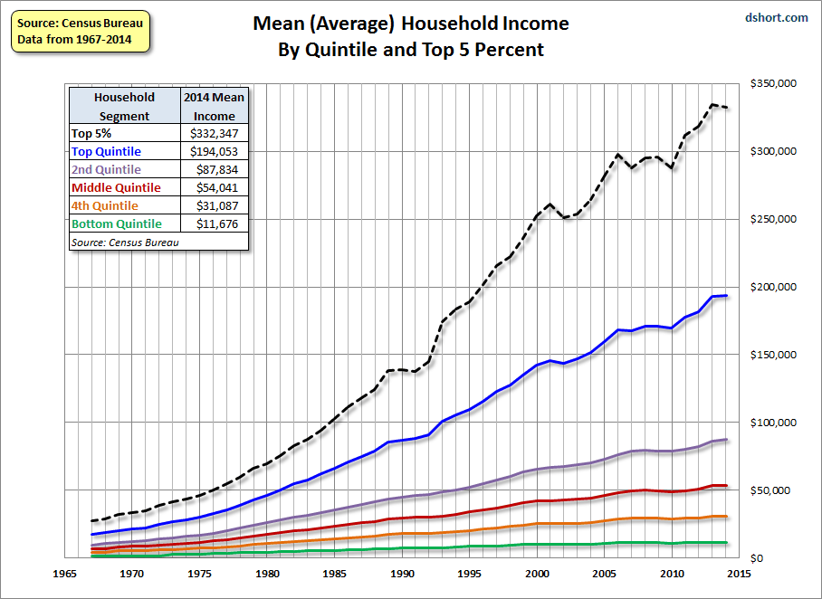
I give up. You are just being dense. My statement is that in the aggregate the new service jobs pay at least as much if not more than the lost manufacturing jobs. Unemployed people do not have jobs and therefore are not in the data set of comparing what service hobs pat vs. manufacturing jobs. All you seem to want to do is talk about income distribution, probably income inequality. That is an entirely different subject. FTR the following chart (sorry for the scaling) that report U.S. PER CAPITA INCOME does not support your statement. It shows that per capita income, save for just a few years, has consistently increased in the U.S. NB - That is per capita income which is total income divided by every man, woman and child in the U.S. not just those working or in the labor pool by all people. Also FTR, why should you believe any published government data on income distribution/inequality? Do you just want to pick and choose want government data yo want to believe? But you will just say потому что Бог хочет это тот путь
Giving up is the best answer. I'm not dense. I simply have zero trust in the accuracy of anything the government says on anything important. They lie like they breathe, and have for a long time.
The difference between "median" and "average" is decisive here, I believe. OK, prove it. потому что Бог хочет это тот путь
Not even in the following data? потому что Бог хочет это тот путь
No. I'm not interested in this research project. It will prove nothing to me, and I know beforehand it will prove nothing to you. Maybe two other people in the world would read it. I'd use time I could have spent on something of else trying to prove something to somebody whom I know from long experience will simpy reject it anyway. The game isn't worth the candle.
Sure, there is plenty there in that data that visually gets to the crux of what I have been saying. But you see that as well as I do, so there's no point in rehashing it.
No, I do not. I don't either, but at least he didn't use the term replace. I think his argument is completely bogus because service sector jobs don't really replace manufacturing jobs. I mean we are talking about people here, and unless the people with manufacturing jobs were retrained and acquired more highly paying service sector jobs, then this argument is a joke. Thats the ruse and the wool pulled over our eyes. Truth is that many of the people who had these jobs are unemployed or underemployed. The new service sector jobs might be a trade off I suppose, but i believe we could have grown our economy and attracted these same service sector jobs AND kept our manufacturing jobs. FREE TRADE LIKE FREE SEX OF THE SIXTIES IS A LIBERAL LIE DEVOID OF RESPONSIBILITY. They think if a little bit is good, then a lot is GREAT...Woo Hoo. Same with diversity and globalism...lets just embrace the change and enjoy the ride. And if we disagree, well then we are just not very good GLOBAL CITIZENS now are we. HA HA
Word.


#2. To: SOSO (#0)
#3. To: paraclete (#2)
all this proves is wages have been chasing inflation
#4. To: SOSO (#3)
(Edited)
That is mathematical impossible.
#5. To: paraclete (#4)
That is mathematical impossible.
#6. To: SOSO (#0)
Average Hourly Earnings: Deciphering Historical Trends
#7. To: buckeroo (#6)
Average Hourly Earnings: Deciphering Historical Trends
#8. To: SOSO (#3)
#9. To: Vicomte13 (#8)
There are at least three ways in which the lost manufacturing jobs can nevertheless be accompanied by the same comparable hourly wages.
#10. To: SOSO, Vicomte13 (#9)
Why don't you post the data in terms of the median if you wish. I am not getting paid for doing this.
#11. To: SOSO (#9)
#12. To: SOSO, y'all (#9)
More lines to confound you. Manufacturing jobs were higher paying jobs?
#13. To: SOSO (#9)
You just cannot escape the rigors and precision of arithmetic
#14. To: Vicomte13 (#13)
do not challenge your sincerity at all. I do not challenge the work you have done. I do state flatly that the product of your work is a picture that is as realistic as Soviet-era and Communist Chinese production statistics. The math produces those outcomes from official statistics, but the official statistics themselves are faked - not by you, but by the officials themselves.
#15. To: tpaine (#12)
A 'service economy' is not self sustaining.
#16. To: Vicomte13 (#11)
Our inflation numbers themselves are tricked. They are established by the government, using a formula that has been tinkered with again and again in ways that consistently show inflation to be less than it is. It is eye opening to look into the making of the numerical sausage.
#17. To: All (#16)
#18. To: vicomtes13 (#17)
#19. To: All (#0)
#20. To: SOSO (#16)
Do you agree that the data as presented, whether messaged or not, shows the result that the new service jobs pay at least as well as the lost manufacturing?
#21. To: Vicomte13 (#20)

#22. To: SOSO (#21)
#23. To: Vicomte13 (#20)
No, I do not.
#24. To: Vicomte13 (#22)
Giving up is the best answer. I'm not dense. I simply have zero trust in the accuracy of anything the government says on anything important.
#25. To: SOSO (#23)
OK, prove it.
#26. To: SOSO (#24)
#27. To: Vicomte13 (#20)
Do you agree that the data as presented, whether messaged or not, shows the result that the new service jobs pay at least as well as the lost manufacturing?
#28. To: MarshND (#27)
Top • Page Up • Full Thread • Page Down • Bottom/Latest
[Home] [Headlines] [Latest Articles] [Latest Comments] [Post] [Mail] [Sign-in] [Setup] [Help] [Register]