
Economy
See other Economy Articles
Title: Average Hourly Earnings: Deciphering Historical Trends
Source:
soso
URL Source: http://www.advisorperspectives.com/ ... Average-Hourly-Wage-Trends.php
Published: Feb 20, 2016
Author: Doug Short
Post Date: 2016-02-20 20:03:29 by SOSO
Keywords: None
Views: 10271
Comments: 28
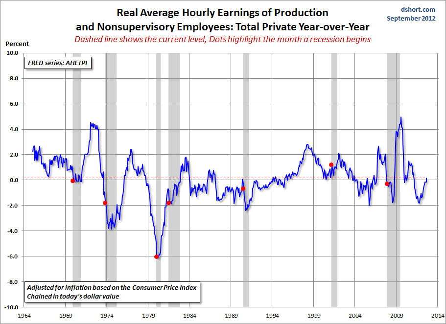
Average Hourly Earnings: Deciphering Historical Trends September 12, 2012 by Doug Short There is, however, another broad series that dates from 1964 -- one tracks the hourly earnings for Production and Nonsupervisory private employees. Before we look at that complete series, here is an overlay of the two (Total Private and Production/Nonsupervisory) for the overlapping timeframe. The objective is to see the relative correlation between the two. Now let's step back and view the complete Production/Nonsupervisory series, which dates from January 1964 (giving us a January 1965 start for the YoY data). At first glance the chart looks horrible. We are currently at a level below the start of all recessions. But the chart above is totally misleading. The single biggest force in hourly wages over the last half century has been inflation. So let's have a look at the same chart, but this time with the hourly wages adjusted for inflation using the Consumer Price Index as the deflator and chained to today's dollar. The "real" picture is far less grim. Yes, hourly wages, YoY, are currently just fractionally above zero (0.15% to be precise), but that's higher than the YoY number at the start of all but one of the recessions in this timeframe. But wait. Before you write me off as a hopeless optimist on private wages, let's look at two more snapshots: nominal and real wage growth using dollar values for the vertical axis. Remember, the series that starts in the 1960s is for Production and Nonsupervisory employees. To give us a clue about the spread between the longer series and the total private series from early 2006, I've included it as well (the red line). The first of this pair has an obvious look about it. Hourly wages have grown dramatically. But when we adjust for inflation using the CPI, we get a very different picture. Real hourly earnings peaked in January of 1973 and hit a trough in May of 1995. Note that the peak was followed later in the year by the Oil Embargo and the onset of the era of stagflation. There are many underlying forces at work in the chart above: the growth of women in the labor force (which began accelerating in 1973 and began peaking in the mid-1990s), gender differences in wages, the impact of automation on labor tasks, the secular trend away from manufacturing toward services, etc. Suffice to say that, in real terms, the average hourly earnings for Production and Nonsupervisory employees, as the latest update, comes to about $39,500 for a 2000-hour work year. The average for all private employees (the series that dates from 2006) is about $7,500 more at $47,040. Are these dramatic advances over the mid-1960s? No. When we adjust for inflation, chained in today's dollar, the average annual figure in 1964 would have been $37,072 (the comparable purchasing power of a 1964 annual salary of $5000 for Production/Nonsupervisory employees). At the household level other trends were afoot -- not least of which was the growth of two-income households as more women entered the workforce. But the percentage of two-income households has been eroded by the Great Recession and the demographics of aging boomers entering their retirement years. If we look at the Census Bureau's historical data, we can calculate that the ratio of two-income households to single-income households peaked in 1994 at 51.5% (see Table H-12). The ratio of two-income households to all households peaked the following year at 35.5%. As of 2010, the most recent year in the CB's published data, the ratios have dropped to 45.5% and 31.6%, respectively. I'll close this commentary with a longer look back. The main series illustrated above was for Production and Nonsupervisory employees dating from 1964. The BLS has a series dating from 1939 for Manufacturing employees. Here it is, adjusted for inflation. The year of the peak resonates with me personally in one respect. It was the year I had my first encounter with a personal computer, the Apple II, which was released in 1977. That fledgling Apple quickly demolished its early competition, Radio Shack's TRS-80 and the Commodore PET. Flash forward to the present: Last month we learned that Apple has set a new record for market capitalization. The Apple II, of course, was a manufactured product, but one that introduced the masses to radically new ways to approach business and pleasure. It marked a turning point in the transition from the Era of Manufacturing to the Information Age. I remain skeptical of average hourly earnings, nominal or real, as a leading or coincident indicator of business cycle peaks and troughs. But in the larger historical context, a chart of hourly wages tells us a great deal about once-in-a-lifetime secular trends in our economy and culture. Poster Comment: Some lessons are worth reviewing as many rend for forget them and more seem never to have learned this one. "There are many underlying forces at work in the chart above: the growth of women in the labor force (which began accelerating in 1973 and began peaking in the mid-1990s), gender differences in wages, the impact of automation on labor tasks, the secular trend away from manufacturing toward services, etc. From a wages standpoint, the manufacturing-driven economy in the US peaked in January 1978. The greatest acceleration was during the WWII years, I remain skeptical of average hourly earnings, nominal or real, as a leading or coincident indicator of business cycle peaks and troughs. But in the larger historical context, a chart of hourly wages tells us a great deal about once-in-a-lifetime secular trends in our economy and culture." 


 From a wages standpoint, the manufacturing-driven economy in the US peaked in January 1978. The greatest acceleration was during the WWII years, followed by a dip during the adjustment period bracketed by the first two post-war recessions. The acceleration resumed, at a reduced pace, to the peak in January 1978.
Post Comment Private Reply Ignore Thread
Top • Page Up • Full Thread • Page Down • Bottom/Latest
Begin Trace Mode for Comment # 10.
#2. To: SOSO (#0)
all this proves is wages have been chasing inflation
It proves much, much more than that. But it appears that you will never know. Ask yourself, please, if the lost manufacturing jobs have been replaced by lower paying service type jobs how come the real hourly wage in 2014 was the same as in 1969? That is mathematical impossible.
There are at least three ways in which the lost manufacturing jobs can nevertheless be accompanied by the same comparable hourly wages. FIRST: there is the question of inflation. The numbers may be "inflation adjusted", but of course the inflation statistics themselves are monkeyed with in ways that under-report real inflation. SECOND: there is the matter that the wages of which you speak are AVERAGE. The average of $60,000 and $40,000 is $50,000. But the average of $99,000 and $1000 is also $50,000. In the earlier case, both ends of the average can live. But in the second case, the first person lives well and the second person can't survive. Both averages are the same. We all know that the wages at the top of the scale have twisted way upwards relative to the average. So, you have McJobs at lower wages, and you have high paying jobs in the favored sectors living well. Same average, but much worse actual conditions for the bottom half. If you want to be more persuasive, use median figures, not average figures. THIRD, there is the matter that if you measure unemployment the way it used to be measured, during the Depression, or the way it is measured in other countries, the American unemployment rate is about 16%, not 6%. Once people drop out of the work force, they don't have wages at all, and they drop out of the statistics. So, your "average wage" can stay the same, in a society where suffering grows immensely, because the people utterly wiped out by the loss of manufacturing, and unable to become permanent re-employed, don't even figure in your numbers. But they DO vote. For Trump.
"FIRST: there is the question of inflation. The numbers may be "inflation adjusted", but of course the inflation statistics themselves are monkeyed with in ways that under-report real inflation." The charts report REAL Wages, i.e. adjusted for inflation. So as long as the basis for adjusting for inflation over the time series of the data being reported has not changed this is not at factor. "SECOND: there is the matter that the wages of which you speak are AVERAGE." If you want to be more persuasive, use median figures, not average figures." The persuasiveness of data isn't any more or less whether it is reropted as the median/average or the mean. Neither alone gives you a full picture of what the data set looks like. The fact is that for the purpose of this discussion the reporting of average income vs. mean income or vice versa doesn't make too much of a difference. Given that the charts report income for Non-supervisor workers the spread between lower paid and higher paid non-supervisory personnel is not likely to be significant, and certainly not an order of magnitude. The extent to which the average is different from the median is an indication about the size of the standard deviation, or how wide the data is scattered and/ or skewed. Now the standard of deviation around the average in any given year of over a period of time in question could have changed. Given that the charts report income for Non-supervisor workers the standard deviation around the median is not likely to have varied much and the difference between the mean and median is likely not that much as well. Why don't you post the data in terms of the median if you wish. I am not getting paid for doing this. "So, your "average wage" can stay the same, in a society where suffering grows immensely, because the people utterly wiped out by the loss of manufacturing, and unable to become permanent re-employed, don't even figure in your numbers" First, these are no MY numbers but what the U.S. government reports. NOw, given that the REAL average wage of Total non-supervisory personnel is the same in 2014 as it was in 1969, the only way that that could happen is if the wages of remaining service employees were at least as high or higher than the wages of the manufacturing jobs that were lost. The arithmetic on this is irrefutable. Less people would have to be making the same or more hourly wage elsewise the average wage would decline not remain the same. An additional point, there were a whole lot more people working in 2014 than in 1969. In other words, the number of data points grew by a significant amount over that time frame. This is strong, if not irrefutable, evidence that the new service jobs were paying at least as much as the manufacturing jobs that were lost. You just cannot escape the rigors and precision of arithmetic, especially when you are dealing with a huge amount of data in the data set.
We know, you are not paid for the honest inquiry or debate.
There are no replies to Comment # 10. End Trace Mode for Comment # 10.
Top • Page Up • Full Thread • Page Down • Bottom/Latest
#3. To: paraclete (#2)
all this proves is wages have been chasing inflation
#8. To: SOSO (#3)
#9. To: Vicomte13 (#8)
There are at least three ways in which the lost manufacturing jobs can nevertheless be accompanied by the same comparable hourly wages.
#10. To: SOSO, Vicomte13 (#9)
Why don't you post the data in terms of the median if you wish. I am not getting paid for doing this.
Replies to Comment # 10.
[Home] [Headlines] [Latest Articles] [Latest Comments] [Post] [Mail] [Sign-in] [Setup] [Help] [Register]