United States News
See other United States News Articles
Title: Was 2010 the Warmest Year Ever?
Source:
[None]
URL Source: http://www.powerlineblog.com/archives/2011/01/028246.php
Published: Jan 31, 2011
Author: powerlineblog
Post Date: 2011-01-31 12:48:28 by no gnu taxes
Keywords: None
Views: 8652
Comments: 27
It is widely being reported that, based on surface-temperature data from the National Oceanographic and Atmospheric Administration (NOAA) and the National Aeronautics and Space Administration (NASA), 2010 was tied for the warmest year on record. What is not so widely reported is that those surface temperature data have been so shamelessly manipulated by climate alarmists that they are entirely unreliable. For a short course in one of the great scientific scandals of all time, go here. There are a number of things wrong with the data produced by NOAA and NASA, but one of the most basic involves the urban heat island effect. It it commonly understood that cities are warmer than the surrounding countryside; you see that every day in weather reports. Thus, weather stations located in urban areas, as many of them are, tend to show increasing temperatures as urbanization and changing land use make the immediate area of the weather station warmer. One study indicated that even a tiny village of 1,000 people can warm temperatures by up to 3.8 degrees F. NOAA and NASA used to acknowledge the urban heat island effect and try to correct for it, but that didn't produce the sort of alarming temperature increases that warmists are looking for. This is how NOAA depicted US temperatures from 1880 to 1999, as posted on NASA's web site in 1999; James Hansen, the head of NASA's climate unit and one of the worst of the alarmists, said truthfully in 1999: The U.S. has warmed during the past century, but the warming hardly exceeds year-to-year variability. Indeed, in the U.S. the warmest decade was the 1930s and the warmest year was 1934. That didn't get the warmists where they were trying to go, so they have now changed the data by eliminating or drastically reducing the urban heat island effect. NASA now shows very different data for the period 1880-1999 from what it published in 1999. This animated GIF shows how the alarmists changed their own data to create the false impression of a climate crisis: 

Post Comment Private Reply Ignore Thread
Top • Page Up • Full Thread • Page Down • Bottom/Latest
#1. To: no gnu taxes (#0)
Perhaps somewher on the planet; definitely not where I am.
"It's all a conspiracy" four different data sets, land and satellite records and thousands of scientists all over the world are in on it. Only Jim Inhofe knows the truth.
Since January 3, 2011, Republicans have controlled the power of the purse.
James Hansen, Reto Ruedy, Jay Glascoe and Makiko Sato, August 1999. Guess what, they were correct.
Since January 3, 2011, Republicans have controlled the power of the purse.
Does Urban Heat Island effect exaggerate global warming trends?
Since January 3, 2011, Republicans have controlled the power of the purse.
Once again, it took me about 5 minutes to find a "refudiation" of your latest blogosphere idiocy: ------ http://www.firstthings.com/blogs/secondhandsmoke/2011/01/30/global-warming-hysteria-did-nasa-cook-the-books-on-warming-statistics/ BZZZT.... try again....
Since January 3, 2011, Republicans have controlled the power of the purse.
Problem is that there are no remote stations in the Artic.
It's spelled "arctic" and weather stations have been there since 1950. Do you have any other idiocy you'd like to share in this thread?
Since January 3, 2011, Republicans have controlled the power of the purse.
in populated heat islands.
I guess you did have more idiocy that you wanted to post. One of the stations is located in Eureka, a small staging area used by those hiking to the North Pole. Then there's the Resolute Weather Station, located on a now abandoned air base on Cornwallis Island, pop. 229, over its 2,700 square miles. You know, usually I have to work a bit to expose your complete and utter lack of knowledge of the subjects you post, you are making it easy this time.
Since January 3, 2011, Republicans have controlled the power of the purse.
ping to the post above this one - what's the old saying, better to keep your mouth shut and let folks think you are an idiot rather than open it and prove it?
Since January 3, 2011, Republicans have controlled the power of the purse.
Then there's the Resolute Weather Station, located on a now abandoned air base on Cornwallis Island, pop. 229, over its 2,700 square miles. Are you really this stupid? All of the stations are located in areas of human population with associated heat island effects, including the concrete infrared reflections. Of course, there's no NYC there. And up until 1999, even Hanson acknowledged such until it was detrimental to his agenda. Look at how they changed their data. God, you're fucking dumb.
Homogenizing: Hey, if We Only Have Weather Stations in Urban Heat Islands and None in the Cooler, Higher, Rural Areas, You Know What We'll Do? We'll Just Use Our City Data to "Extrapolate" Into the Colder Rural Areas This is what's going on with the Russia temperature data, too. Turns out -- how could this be? I don't blame the warmmongers for it but how did this happen? -- the world has been losing, not gaining, temperature stations for the past 50 years, and most of the lost stations came from higher-latitude and higher-altitude, no-heat-island rural areas, in other words, the best, most pristine gauges of actual temperature, unchanged by the hot sprawl of Man. And most of the ones that didn't get eliminated were in... cities. Or built up towns and suburbs. And mostly at lower altitudes, too (by sea level -- where most of the human population clusters). And so what happens when the bulk of your old weather stations get discontinued? Well, if you're a genius climate researcher, you just fill in these unmeasured expanses with homogenized (I think) type data from the city stations still in use. Voila! You had no idea of what the temperature was in rural Russia so you guessed it was probably pretty close to the temperature in Moscow, and you filled it thus! And look! Look at all this global warming and tremble. http://minx.cc/?blog=86&post=295982
Give it up. He's not INTERESTED in facts. He is quite comfortable and happy in whatever delusions he's pushing, reality be damned. He is of the group that believes that reality is not necessarily objective, but subjective. That is, if the consensus belief is that the Earth is made of cottage-cheese, then they'll ALL believe that, no matter what facts you bring to the table. It sounds absurd, I know... But that's the "Interpretivist" mindset, which is quite common in qualitative research... If you google interpretivism, you'll see what I mean. They believe... whatever they want to believe, and nothing will change them...
"There will be no more money when the U.S. dollar has no value, until that time we can keep printing more." -- go65, LF's answer to Ben Bernanke --
Even the satellites and ocean sensors? You don't know when to quit, do you?
Since January 3, 2011, Republicans have controlled the power of the purse.
More debunked BS. And note that the greatest warming has occurred in northern Russian, as well as Alaska and Greenland. Not exactly heavily populated areas. Go here and you'll find charts showing consistent warming in both urban and rural areas in China, Austria and England.
Since January 3, 2011, Republicans have controlled the power of the purse.
In fact, the satellite tells quite a different story:
I have no idea what that chart is. Could you provide a source and perhaps some description.
Since January 3, 2011, Republicans have controlled the power of the purse.
Scientist says Arctic getting colder A Russian scientist says the Arctic may be getting colder, not warmer, which would hamper the international race to discover new mineral fields. An Arctic cold snap that began in 1998 could last for years, freezing the northern marine passage and making it impassable without icebreaking ships, said Oleg Pokrovsky of the Voeikov Main Geophysical Observatory. "I think the development of the shelf will face large problems," Pokrovsky said Thursday at a seminar on research in the Polar regions. Scientists who believe the climate is warming may have been misled by data from U.S. meteorological stations located in urban areas, where dense microclimates creates higher temperatures, RIA Novosti quoted Pokrovsky as saying. "Politicians who placed their bets on global warming may lose the pot," Pokrovsky said. http://www.upi.com/Science_News/2010/04/23/Scientist-says-Arctic-getting-colder/UPI-94431272034113/
Problem is that there are no remote stations in the Artic. It's spelled "arctic" Republican science on display there - lol!
"Keep Your Goddamn Government Hands Off My Medicare!" - Various Tea Party signs.
he's wrong: http://news.discovery.com/earth/warm-north-atlantic-heating-arctic.html http://nsidc.org/arcticseaicenews/ Since January 3, 2011, Republicans have controlled the power of the purse.
Another Russian Scientist: Arctic Is Cooling Yet another Russian scientist believes the Arctic is set for cooling and thus increasing sea ice, this reported in the German version of the Russian online news RIA NOVOSTI (see links below). Scientist Vladimir Sokolov says: The warming that occurred in the Arctic has swung back to cooling and sea ice that melted over the past years is recovering. http://de.rian.ru/science/20100427/126088756.html, The English version is here: http://en.rian.ru/russia/20100427/158771845.html Arctic sea ice reached a historic minimum in 2007 when it shrank to 4.28 million sq km. But the trend now appears to have reversed. According to the weather observation administration Roshydromet, it has grown by a fifth reaching 5.2 million square km in 2009, Sokolov said at the Petersburg Research Insttitute for the Arctic and Antarctic on Tuesday. Sokolov calls predictions of continued shrinking Arctic ice “incorrect”. He says the cooling is due to the polar night and the associated missing sunlight, and this as a result will lead to ice formation. Some scientists are warning that politicians and corporations who promise lucrative oil and gas projects in the Arctic may have made dramatic miscalculations. The researchers say that no warming will take place, instead cooling will impact the earth over the next decades. http://notrickszone.com/2010/04/28/another-russian-scientist-arctic-is-cooling/
Yet another Russian scientist believes the Arctic is set for cooling and thus increasing sea ice, this reported in the German version of the Russian online news RIA NOVOSTI (see links below). Scientist Vladimir Sokolov says: He's wrong too. Just like the idiots who claim there are no temperature sensors in the artic [sic]. http://www.canada.com/technology/Canada+warmest+winter+ever+beyond+shocking/2666979/story.html Since January 3, 2011, Republicans have controlled the power of the purse.
ScienceDaily (July 29, 2010) — Parts of the Arctic have cooled over the past century, but temperatures have been rising steeply since 1990. This is the finding of a summer temperature reconstruction for the past 400 years produced on the base of tree rings from regions beyond the Arctic Circle. http://www.sciencedaily.com/releases/2010/07/100729101607.htm
Since January 3, 2011, Republicans have controlled the power of the purse.
Russian Academy of Sciences
Since January 3, 2011, Republicans have controlled the power of the purse.
Arctic Adds 2000 Cubic Kilometers Of Ice – Despite Reports Of Accelerating Ice Melt These media reports were based on a study published in Science. The authors write in the abstract (emphasis added): Here, we present a multidecadal-scale record of ocean temperature variations during the past 2000 years, derived from marine sediments off Western Svalbard (79°N). We find that early–21st-century temperatures of Atlantic Water entering the Arctic Ocean are unprecedented over the past 2000 years and are presumably linked to the Arctic amplification of global warming.” I’m not sure what they mean by “early 21st century”. Perhaps the years 2000 to 2007? The study says the waters are about 2°C warmer. Here it has to be noted that they are presuming, i.e. postulating. The CO2 link here is a bit of wild speculation. Here’s how Der Spiegel puts it in a report titled Atlantic Current Is Heating Up The Arctic: The experts suspect that the accelerated reduction in sea ice and the measured warming of ocean and atmosphere in the Arctic over the last decades, among other factors, was the result of an enhanced transfer of warmth from the Atlantic. The Fram Straits is even about 1.4° C warmer than during the Medieval Climate Optimum, a time when temperatures in Europe were significantly increased.” And Der Spiegel writes: ‘Cold sea water is decisive in the formation of sea ice, which in turn cools because it reflects sunlight,’ says Thomas Marchitto of the University of Colorado in Boulder. The melting is accelerating by itself.” Media reports like the one in Der Spiegel of course emphasized the supposed vicious circle of the melting Arctic ice dynamic: more melting leads to more warming, which then accelerates the process – all unleashed of course by man-made CO2. If anything they are, perhaps unwittingly, admitting that the Arctic sea ice reduction of the 2000s can be traced back to ocean currents. And as things stand right now, just the opposite is occurring. The Arctic is NOT melting, it’s freezing up again - recovering from its low in 2007, and quite impressively. The Global Rumblings website here reports that 70 trillion cubic feet of ice have been added to the Arctic core since January 2009. That translates to 2000 cubic km – enough to cover Manhattan with 20 miles of ice (or 32,000 Manhattans with 1 meter of ice). The US Navy PIPS 2.0 graphic shows ice thickness. The following comparator shows how it’s the Arctic that has gone green. Source: Global Rumblings Some will say that PIPS is not a reliable indicator of Arctic ice thickness, and so cannot be used reliably. But you can put that rumour to rest, see PIPS WUWT. So why is the Arctic thickening and regrowing, and no longer melting at an unprecedented rate as claimed by the media? This could have to do with the Labrador Current, which flows southward between Greenland and Labrador. Reports say it is slowing down. That means cold water is not getting transported out of the Arctic. A Der Spiegel article just 2 weeks ago titled ”Feared Atlantic current is now weakening” suggests that this current is at its weakest level in 1800 years. What is it caused by? According to scientists, Der Spiegel says: As a cause for the change, scientists suspect climate change. The coincidence that this has happened during the warming of the last decades allows this to be the conclusion, they believe. But the knowledge about ocean currents still has many holes says Wallace Broecker of Columbia University in USA – a pioneer in ocean research.” Changes in the atmosphere controls the ocean currents? Right. And as usual, they’re sure – yet admit there are many holes in the knowledge and so they are not sure. Meanwhile, the ice keeps growing. http://notrickszone.com/2011/01/31/arctic-adds-2000-cubic-kilometers-of-ice-despite-reports-of-accelerating-ice-melt/
yes, ice coverage typically increases in winter, but volume is still way down. Again, with each consecutive post you indicate your lack of understanding of physics. Since January 3, 2011, Republicans have controlled the power of the purse.
Was 2010 the Warmest Year Ever?
#2. To: no gnu taxes (#0)
What is not so widely reported is that those surface temperature data have been so shamelessly manipulated by climate alarmists that they are entirely unreliable.
#3. To: All (#2)
(Edited)
In the meantime, we can venture two "predictions" on "whither U.S. climate". First, regarding U.S. temperature, we have argued (Hansen et al., 1999a) that the next decade will be warmer than the 1990s, rivaling if not exceeding the 1930s. Second, regarding precipitation and drought, even without analysis of regional patterns of change, we can offer the probabilistic statement that the frequencies of both extremes, heavy precipitation and floods on the one hand and droughts and forest fires on the other, will increase with increasing global temperature. The rationale for this (Hansen et al., 1991) is that increased surface heating increases evaporation, and this increases the intensity of both precipitation and drought conditions where and when they occur.
#4. To: go65 (#2)

#5. To: no gnu taxes (#0)
#6. To: no gnu taxes (#4)
The original article was written by Joseph D’Aleo, co-founder of the Weather Channel, noted climate skeptic, and former weatherman. D’Aleo’s article was picked up by John Hinderaker, lawyer, climate skeptic, and conservablogger at Powerline. Neither author shared the source for their information. Hinderaker appears to have constructed the comparison animation. The greatest difference between the two graphs was from new data, added after 1999. Both D’Aleo and Hinderaker claim the data were modified but provide no evidence other than the unsourced graphs.
The original graph was labeled “US” and appears to represent US and not global temperature records. The US land mass, although important to us, represents only 2 percent of the Earth’s surface. It is also well recognized by genuine climate scientists that the US has not warmed as much as other Earth regions. Hinderaker unintentionally conflates US temperature with global temperatures, a rookie mistake. Note also that the NASA-GISS temperature record is only one such record available. There are others, including weather balloon data and a satellite based systems, that all show the same increase in global temperature.
The satellite measurements also show cooling in the stratosphere, consistent with the retention of heat in the lower atmosphere. Satellites demonstrate decreases in the both the area and volume of arctic ice. The oceans are warming, too, and sea levels are rising from the thermal expansion of water. Global humidity is increasing, consistent with warming.
“I have no idea if this is true or not”, you typed, yet you have thousands of climate scientists on one side of the argument and a right-wing lawyer and right-wing former weatherman on the other. In fact, a reasonably independent person would have an idea in Hinderaker’s claims were true or not.
Finally, Hinderaker claims that the raw data and methods have been kept hidden. This is blatantly untrue, likely another unintentional oversight on Hinderaker’s part. The data are available and have been used in dozens of temperature reconstructions using different corrections and different programs. Global warming is a consistent finding.
Evidence supporting the warming of the Earth is overwhelming and is consistent with the demonstrated increase in greenhouse gases.
#7. To: go65 (#5)
they have compared the data from remote stations (sites that are nowhere near human activity) to more urban sites.

#8. To: no gnu taxes (#7)
Problem is that there are no remote stations in the Artic.
http://www.thecanadianencyclopedia.com/index.cfm?PgNm=TCE&Params=A1ARTA0003751
#9. To: go65 (#8)
and weather stations have been there since 1950.
#10. To: no gnu taxes (#9)
in populated heat islands.
#11. To: Godwinson, skip intro, ferretmike, fred mertz, lucysmom, brian s, (#10)
#12. To: go65 (#10)
One of the stations is located in Eureka, a small staging area used by those hiking to the North Pole.
#13. To: go65 (#11)
#14. To: no gnu taxes (#13)
#15. To: no gnu taxes (#12)
(Edited)
Are you really this stupid? All of the stations are located in areas of human population with associated heat island effects, including the concrete infrared reflections.

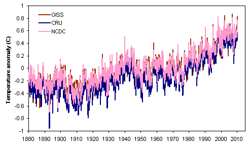
Comparison of global (land & ocean) mean surface temperature reconstructions from NASA GISS, the University of East Anglia's CRU, and NOAA NCDC.
#16. To: no gnu taxes (#13)
(Edited)
Homogenizing: Hey, if We Only Have Weather Stations in Urban Heat Islands and None in the Cooler, Higher, Rural Areas, You Know What We'll Do? We'll Just Use Our City Data to "Extrapolate" Into the Colder Rural Areas

Figure 1. Annual average temperature anomalies. Jones et al (dotted green and brown) is a dataset of 42 rural and 42 urban sites. Li et al (solid green and brown) is an adjusted dataset of 42 rural and 40 urban sites. Li (blue) is a non-adjusted set of 728 stations, urban and rural. CRUTEM3v (red) is a land-only data set (Brohan et al., 2006). This plot uses the 1954–83 base period. 
Change in global temperature: 1885-2006
#17. To: go65 (#15)
#18. To: no gnu taxes (#17)
#19. To: go65 (#15)
#20. To: go65, no gnu taxes (#8)
#8. To: no gnu taxes (#7)
#21. To: no gnu taxes (#19)
(Edited)
Scientist says Arctic getting colder
Warm North Atlantic Heating Arctic
Repeat of a negative Arctic Oscillation leads to warm Arctic, low sea ice extent
Arctic sea ice extent for December 2010 was the lowest in the satellite record for that month. These low ice conditions are linked to a strong negative phase of the Arctic Oscillation, similar to the situation that dominated the winter of 2009-2010.

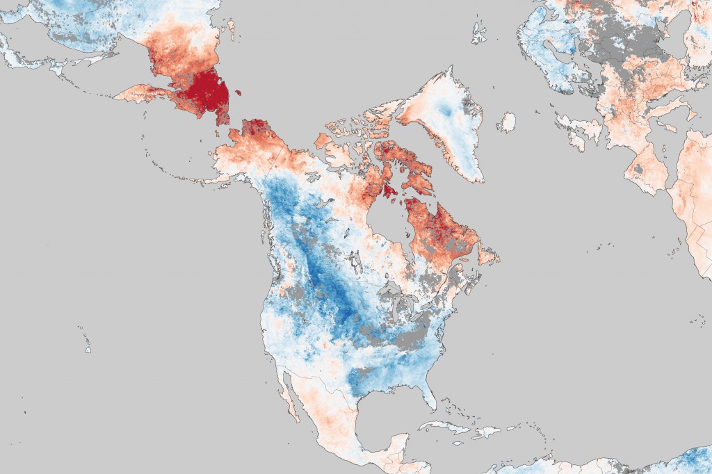
Surface temperature anomalies for the period 17 December 2010 to 15 January 2011 show impressive warmth across the Canadian Arctic….
The largest anomalies here exceed 21°C (37.8°F) above average, which are very large values to be sustained for an entire month.
http://www2.ucar.edu/currents/cold-comfort-canadas-record-smashing-mildness
#22. To: go65 (#21)
#23. To: no gnu taxes (#22)
Another Russian Scientist: Arctic Is Cooling
From the balmy Arctic, to the open water of the St. Lawrence and snowless western fields, this winter has been the warmest and driest in Canadian record books.
Environment Canada scientists report that winter 2009/10 was 4 C above normal, making it the warmest since nationwide records were first kept in 1948. It was also the driest winter on the 63-year record, with precipitation 22 per cent below normal nationally, and down 60 per cent in parts of Alberta, Saskatchewan and Ontario.

Surface Temperature anomalies from NASA's Aqua satellite (MODIS Sensor) from Jan 9-16, 2011. Red is above normal.
#24. To: no gnu taxes (#22)
Signs of Reversal of Arctic Cooling: Rapid Temperature Rise in the Coldest Region of Mainland Europe
#25. To: no gnu taxes (#24)
“In 2005, the Academies issued a statement emphasising that climate change was occurring and could be attributed mostly to human activities, and calling for efforts to tackle both the causes of climate change and the inevitable consequences of past and unavoidable future emissions. Since then the IPCC has published the Working Group 1 part of the Summary for Policymakers of its fourth assessment report, and further reports are expected later this year from IPCC. Recent research strongly reinforces our previous conclusions.”
#26. To: go65 (#21)


#27. To: no gnu taxes (#26)
(Edited)
Arctic Adds 2000 Cubic Kilometers Of Ice – Despite Reports Of Accelerating Ice Melt

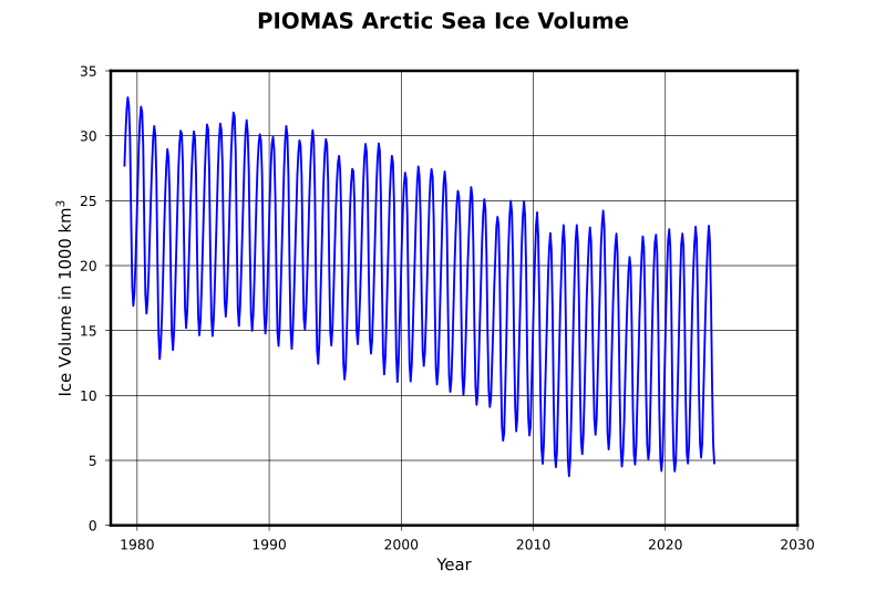
Arctic sea ice volume since 1979. (Image source: Wikipedia. Based on data from University of Washington Polar Science Center.) 
Global sea ice extent since 1979. (Image source: Tamino. Data is from US National Snow and Ice Data Center.) 
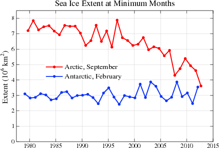
Minimum sea ice extent since 1979 in the Arctic and Antarctic. (Image source: James Hansen. Data is from US National Snow and Ice Data Center.) 
September Arctic sea ice age since 1981. (Source: US National Snow and Ice Data Center.)
Top • Page Up • Full Thread • Page Down • Bottom/Latest
[Home] [Headlines] [Latest Articles] [Latest Comments] [Post] [Mail] [Sign-in] [Setup] [Help] [Register]
